
-1.png)

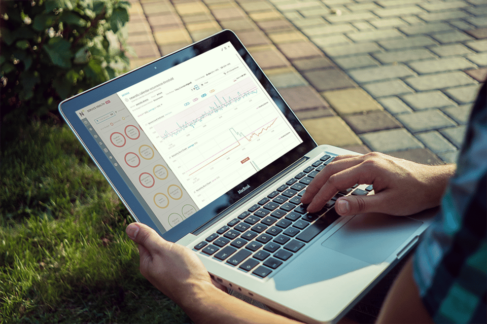
“How’s my reliability right now?” is a common question we get asked from our customers at Nobl9. To easily find an answer and provide a quick view of a customer’s overall organizational health, we created the Service Health Dashboard.
Customers can now quickly see how their organization is doing in terms of Service Level Objectives (SLOs) and error budgets. The Service Health Dashboard easily demonstrates which services are at risk or have burned through their error budget and provides insight into service health.
When we first thought about the Service Health Dashboard, we wanted customers to use it to answer the following questions:
- Which services are fine (so I don’t need to worry about them)?
- Which services have already degraded (so I can make sure the right folks are working on them)?
- Which services are trending in the wrong direction (so I can have someone keep an eye on them)?
Service level metrics and objectives
The Service Level Objectives (SLOs) Health Dashboard is a central place for you to track, measure, and monitor the health of your services. The dashboard displays Service Level Objectives (SLOs) for each of your services.
You can use the dashboard to:
- Track the progress of your services towards their SLOs
- Measure the performance of your services against their SLOs
- Monitor the health of your services in real-time
- Identify and investigate service outages
- Share the health of your services with others
The dashboard is designed to be used by service teams, product teams, and anyone else who wants to track the health of a service.
Monitoring SLO capabilities
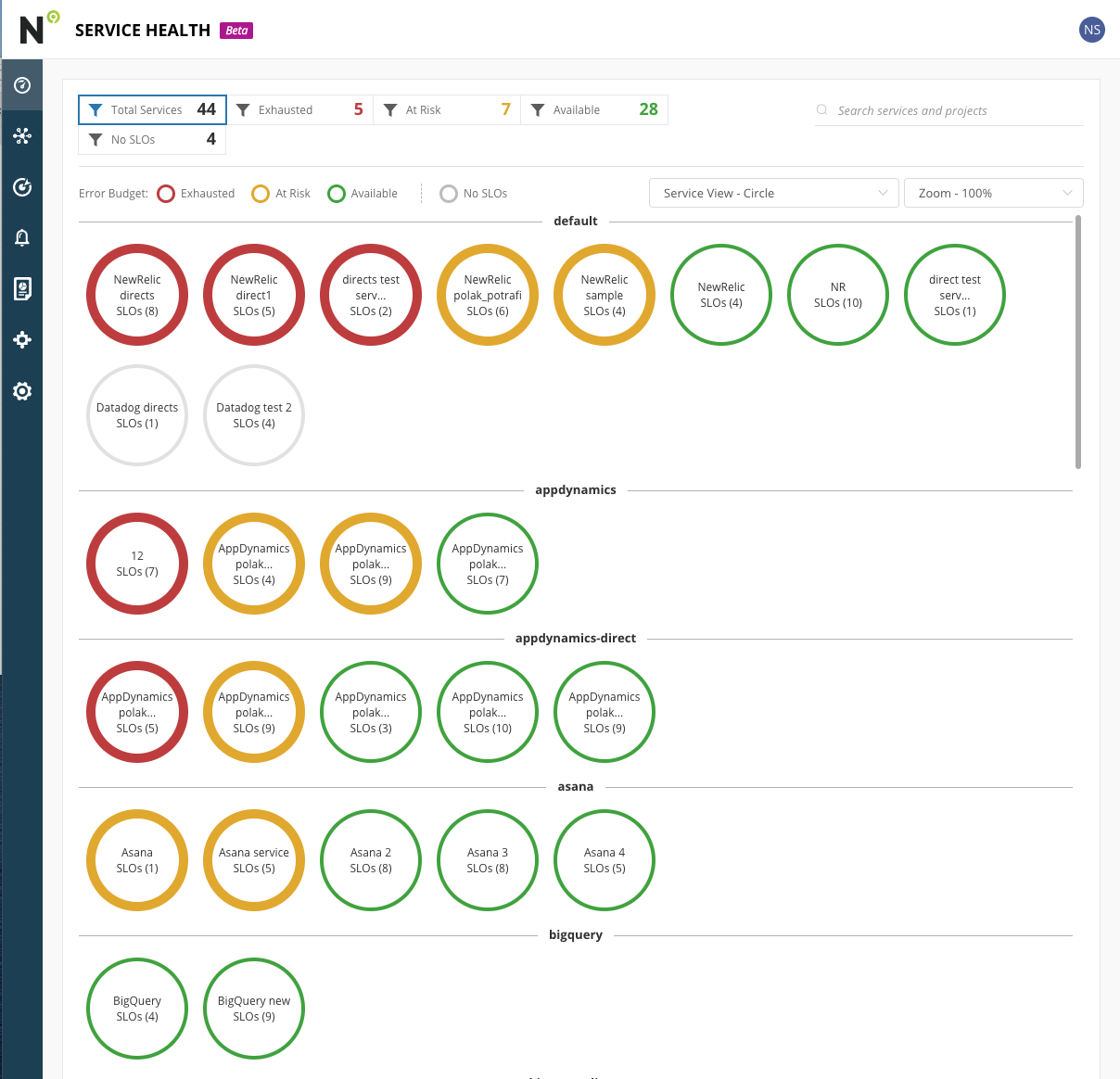
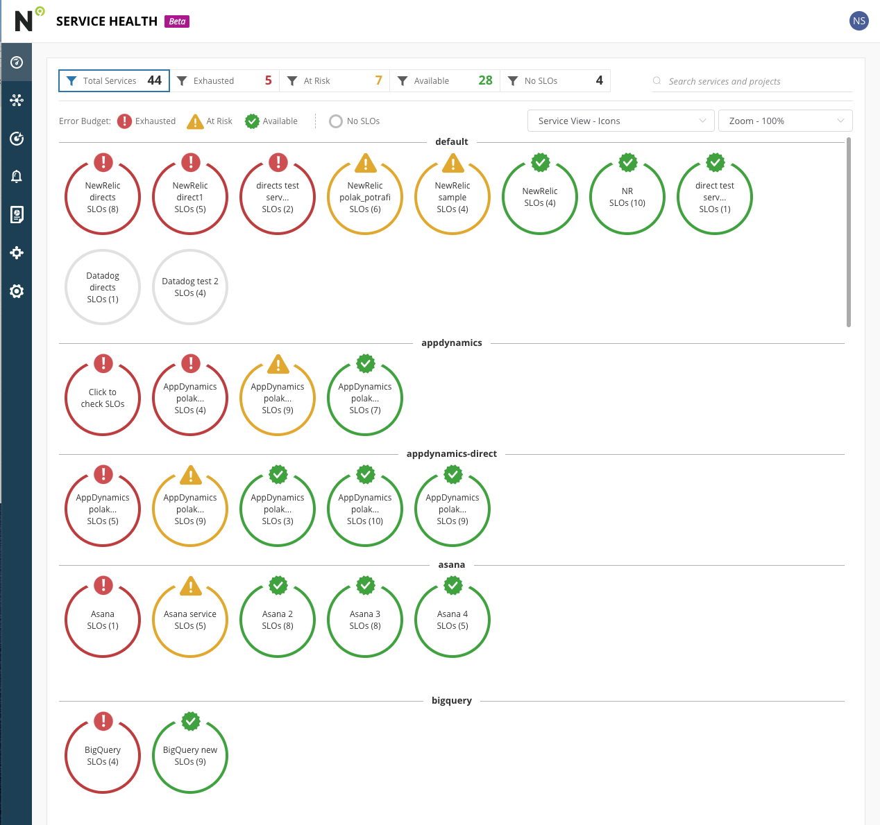
The SLO Dashboard for Service Health monitors and reports on the status of your service's ability to meet its Service Level Objectives (SLOs). The dashboard shows the status (icons along with color coding red-yellow-green) of each service and can be used to identify potential areas of improvement.
Error budget burn rate visualization
Keeping those questions in mind, users will see the dashboard turn yellow when a service has SLOs with their error budget below 20% and red when they exceed all their error budgets for the current time window. Each service is evaluated based on the current time window, so it’s easy to get a high-level view of all services even if their error budgets are being calculated differently.
The error budget burn rate chart allows you to see how your error budget is being spent over time. This is useful for understanding whether you are on track to stay within your budget, or if you need to adjust your plans. The tool also allows you to see how different types of errors are affecting your budget.
Services are grouped by projects, and clicking into the service shows a summary of the SLOs with their remaining budgets.
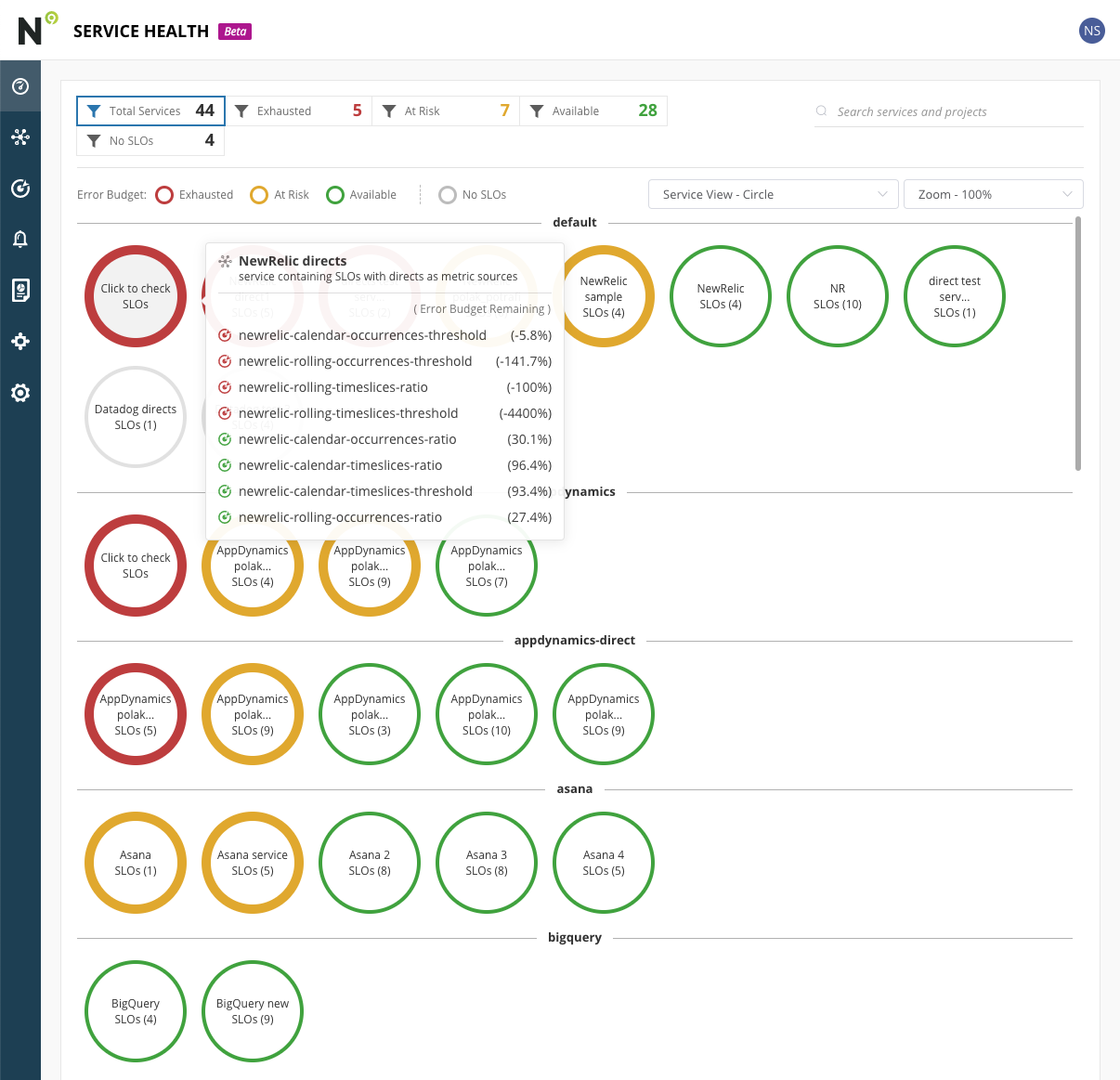
Clicking into each SLO will bring up the SLO details to enable a deeper view of the SLO itself.
We also wanted to provide accessibility functionality and enabled two additional filters, one for zoom and another to change the icons to hexagons or show an icon for different states.
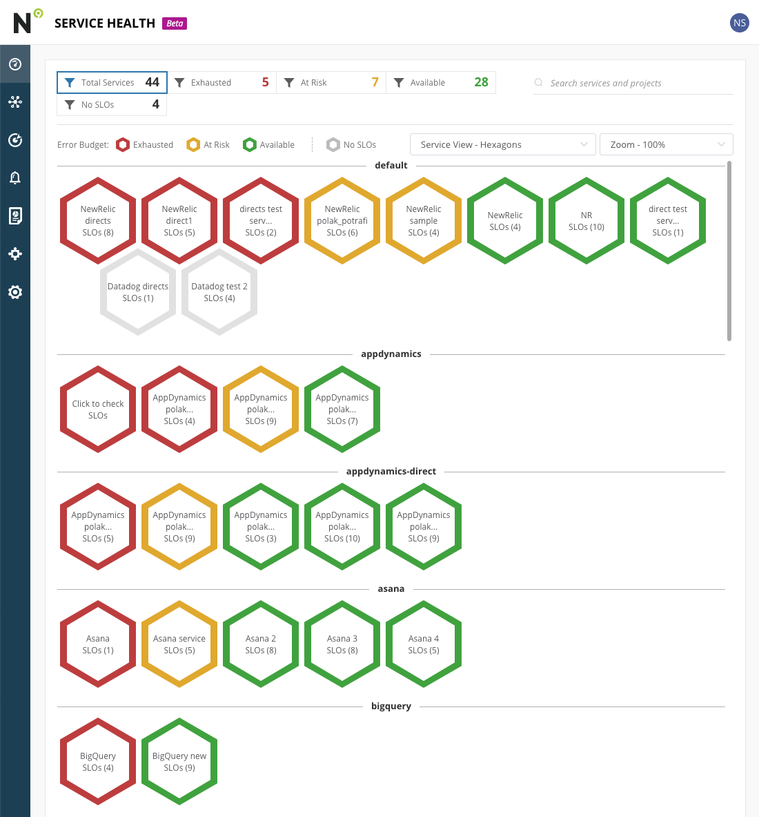
The dashboard also has filters to see all services or only services in a specific state.
How often is the SLO Dashboard for Service Health updated?
The SLO Dashboard for Service Health is updated in real time.
Getting started
We hope these views provide a simple and easy visual of your organization’s service health.
If you’re currently a Nobl9 customer, the dashboards are now available in your account. If you haven’t tried Nobl9 yet and these dashboards look interesting, sign up for Nobl9 Free Edition.
Share:


Do you want to add something? Leave a comment